
")
Email communication has taken over as one of the most common ways to send messages between colleagues on-site and off-site, according to a Radicati study. Despite new communication apps heralding the end times for email every so often, email always seems to carry on as before, indifferent to the dogmas of modern times, progress and the cult of the future.
Well, maybe it doesn’t carry on so poetically. But for the foreseeable future, email will remain a staple of professional communication. We can tailor our email correspondence to meet our business purposes - whether common correspondence or email marketing - and as the medium carries its context, not only does our content matter, but so does its presentation.
Many first impressions are conducted via email. Your great email signature is the chance to shape that impression. A professional email signature is both visually appealing while conveying our skills, experience and contact details.
There's a lot of subjectivity when learning how to make a professional email signature stand out while commanding authority. Fortunately, when it comes to style and implementation, there's a fairly short list of what's acceptable - and no need to push the envelope to present a polished and professional signature.
The Best Examples of Professional Email Signatures
1. Keep it short.
A professional email signature should be short and sweet. Include your name, title, company, contact information and points of professional interest. This might be three or four lines of text - six can work but you're stretching it. When it comes to design, consider 'less is more' - your signature is meant to supplement, not keep people’s eyes from what they want to read.

This email signature is conventional, well-balanced and conveys all essential points - minimal fluff. Don't be afraid to use an email signature generator to maintain control over your signature.
2. Use your brand as a thematic guide.
Your company may have creative restrictions on email signatures. Makes sense - the brand comes first. You'll have to express yourself within the thematic boundaries - typeface, colors, images, icons, arrangement - your logo provides. Some might feel relieved, others might chafe. Don't worry, sometimes limitations produce the best art. Take a look at this email signature by Sombras Blancas Design.

This email signature example incorporates the brand colors and design themes - check out the gently blurred edges - to present the name, title and contact info within the brand voice. Total harmony. Whether you're using a professional email client like Outlook or a free consumer email service like Gmail, you should still keep pushing your brand.
3. Include a headshot.
Attaching a face to a name helps people make personal associations. If you're looking to build a relationship with your recipient, or simply to elicit positive feedback, attaching a headshot with your face next to your name builds a connection with your recipient. A professional headshot must be well-lit and well-shot. You want it to convey attributes desirable to your (or any) profession - competence, intelligence, reliability. It doesn't need to be glamorous. Don't use a selfie.

Round borders or square depends on your taste. In this email signature, the subject's headshot is provided equal weight with her contact information with the brand featured at the bottom. This personal email signature tip will do a nice job of balancing out that professional feel, making you more relatable which is always a plus.
4. Use colors for texture rather than attention.
Colorful email signatures can be an asset in a creative industry. In a more traditional industry, an abundance is visually distracting and can look amateurish. If you're unsure how well you can pull it off, or if your industry isn't that fabulous, it's better to err on the side of caution. A professional email signature can speak more through tasteful arrangements than vibrant colors anyway. Again, stay within the brand palette.

This example, also by Sombras Blancas Design, has a faintly off-white background, two different font colors, and two slightly different typefaces. (Note the brand's typeface has serifs while the other text is sans-serif.) The gentle design conveys reassurance - certainly a point of professional interest for a psychologist -and the subtle coloration helps achieve this.
5. Stick with one or two standard typefaces.
When it comes to typefaces, legibility is the lowest bar you need to meet. It's not uncommon to have more than one typeface - the previous example used two - but aside from the brand lettering, a professional email signature doesn't need more than two. And don't let it get too extravagant or playful. The former - imagine one with grand, sweeping serifs - will make it look like you're sending wedding invitations. The latter - think Comic Sans - will make you look silly and undermine your credibility. Find a crisp, clean font and keep the size between 10 to 12 points.
The exception is a long legal disclaimer that you're required to include, which is an unavoidable eyesore you can keep small.

Note the two typefaces in the above example - one for the logo and one for the details. This typeface gives his email signature a cool, smooth look.
6. Direct the eye with visual hierarchy.
Design your email signature based on what attracts the eye, so readers will naturally flow from one item to the next without clumsy bullet points. Scale, color and font-weight bring attention to the most important elements of the signature, whether your name or the company name. People read from top to bottom, large to small, bold to thin. Use this wisely - highlighting every other word in this manner will have the opposite effect. (If everything is unique, nothing is.)

This design by Email Signature Rescue makes it clear where your eye should go based on font-weight, color, and arrangement. Your eye is naturally drawn to her image, and then proceeds to her name and title while subsequent details are arranged in order of relevance until the bottom of the signature.
7. Break up text with dividers.
Dividers can be graphical or they can be glyphs. A glyph is a symbol within the typeface. I'm thinking specifically of the vertical bar glyph: |. The vertical bar lets you break up awkwardly long lines or unrelated details, avoid empty spaces and cut down on graphical elements if you prefer to keep their number low. The vertical bar glyph is common in professional email signatures, but don't overdo it. Moderation applies in everything, particularly good taste.

This horizontal email signature template by Email Signature Rescue uses the vertical line glyph to separate contact information. Note the designer opts for a bullet point between the name and title - this breaks up the pattern, preventing a sense of overuse, which is helpful considering the headshot is separated from the details by a similar vertical bar.
8. Keep graphics simple.
The more complicated the graphic, the more it attracts the eye - you don't want it to overwhelm the text. If you don't work in a visual industry, you're better off keeping graphics limited to icons, aside from your company logo. In any case, keep your graphics simple, and balance them with an appropriate amount of text to reduce visual 'clutter'.

This example includes both brand consistency and effective, simple graphics. The logo itself is quite minimal, so the rest of the email signature must be careful not to overwhelm it. Notice how your line of sight is pulled from the logo to his name to his title (emphasized with font-weight) then to his contact info - visual hierarchy in action.
9. Use icons to link to social media accounts.
You’ve seen this in previous examples shown here. Nearly everyone has social media accounts; even those without accounts at least recognize the symbols. Presenting your profiles as clickable icons save visual space and provide a smooth appearance to your email signature. Social media links give more information and look good design-wise - two things you want in a professional and creative email signature.
Don't offer every option. Keep it simple with your LinkedIn, Google, and whatever social icons are linked to your company or small business.
![]()
This example, by artist Kalachakravarthi, is comprised mostly of social media icons. In a more conventional industry, this minimal style might be a little sparse on detail for your signature, but you have a clear sense of how the icons themselves send a message.
10. Make your signature mobile friendly.
Aside from maintaining visual balance through the ‘less is more’ ethos, responsive design ensures your email signature is consistent across platforms. People read email on their mobile devices more than ever - don't be that person whose signature becomes obnoxiously large or so small to be unreadable on a mobile screen. Be careful with graphics that have small text - they may not scale well. When it comes to social media icons, put some space between them or make them large enough to be pressed by a finger.
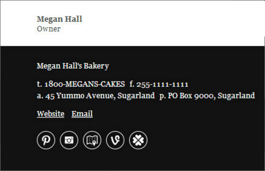
This email signature has a simple yet striking layout with an arrangement that translates well on mobile. The black and white motif is stark and visible. Note the relative size of the social media icons. The omission of a headshot is a design choice; considering the signature belongs to the company owner, there may not be a need for visual identification.
What to Leave Out of Your Professional Email Signature
1. Don't include irrelevant information.
Avoid an excess of text. This includes quotes. What one person finds inspiring, another might find trite. Keep the information in your email signature relevant to your job title, company, skills or contact details - you’re not sending out your resume in your email signature. And you don't need to include every possible method to reach you. Finally, there's no need to put your email address there either. Give your recipients some credit - they'll figure out how to reply.
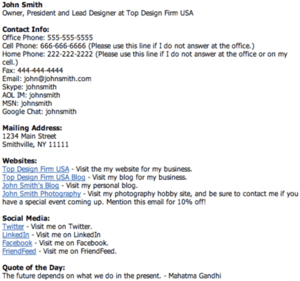
There's so much going on here. It's filled with unimportant information and will swallow up every message in all of your email threads. People will need to write essays to compete with this email signature. One phone number should be enough.
Note: This doesn't count for legal disclaimers. If you're required to include it, put it in. Design matters less when we're talking about staying within legal boundaries. Do business within the law.
2. Don't use excessively large graphics.
The mountaintop vista as viewed through your DSLR from your recent Norwegian vacation is, no doubt, breathtaking in its natural majesty. It will also occupy tremendous space in your recipients’ emails. In a long thread, it becomes annoying to scroll past. Also, keep in mind that most email recipients will be loading your email signature design via their smartphone.

Beautiful, pristine, and not to be shown a thousand times in your professional email signature. Save it for your personal social media where it'll be more appreciated.
3. Don't deploy an overabundance of color.
Like many rules in art, this one is subjective. If your professional field favors artistic creativity, then having a lot of color may be a great thing. It also largely depends on your own ability to coordinate color and your design instincts. The trouble with an abundance of color is there are many more opportunities to get it wrong - clashing colors visual imbalance, over-complication, and a crowding out of the main goal - presentation of your professional attributes. Therefore I don't recommend putting in too much color in your professional email signature, but if you're confident you can pull it off - that's up to you.
For the sake of undermining myself, I show you an example of Miguel Oliva Márquez, who did a great job.
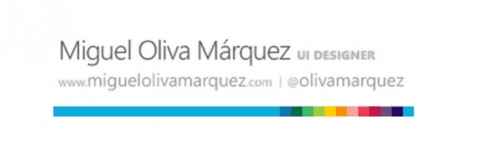
Why does it work? In this case, because the color is concentrated toward one end of a thin strip with the other end balanced by his name in large print with a minimalist motif overall.
Maybe you can do it well. If so, great. If you're uncertain... well, for your professional email signature, I'd advocate erring on the side of caution. But that's just me.
4. Don't use custom or 'fun' fonts.
Earlier I mentioned Comic Sans. You may recall I didn't say anything positive about it. First, I think it's a bit silly to use a computer to imitate childlike handwriting, but that's beside the point. More importantly, fonts like these undermine your credibility as a serious professional.
Using a professional email signature template can keep you from making these kinds of mistakes.
5. Don't let it stagnate.
As your professional details change, update your email signature look. Make sure links work, social media profiles are still relevant, time-sensitive content and calls to action are removed after the specified date passes. Stay on top of it - if it seems mundane to you, it might be time for an update. Technological styles change, too.

This email signature once looked great. Now, I think, it looks outdated. The individual elements are not bad, but we've moved beyond large, rectangular buttons, and two Calls to Action seems excessive. Those two buttons would be better presented as icons.
Be Creative When Making a Professional Email Signature
Art is subjective and certain stylistic faux pas can be made to work, depending on the character of your business. Cater to your audience, your line of work, how well it shows up on different platforms and what you feel needs to be included in every email. If you’re including a CTA, use similar language and tone as what’s used elsewhere in the signature. Consistency is key.
Consider a new email signature or sign-off as your career shifts. The best email signatures give a sense of who the sender is without influencing the tone of a business email.
Certain styles are classic, others change quickly - the goal is to stay current, or even ahead of the curve, and always well-designed.

